Note
In the default configuration, this section of the personal dashboard is available only to users in the Administrative and Technical groups.
For each domain or service, the Statistics
section is available, which displays data on inbound traffic. You can switch between different data categories, periods and views.
You can download the chart as an image by clicking the button. The image will be downloaded in the same size as it was displayed in the browser at the time of saving.
Select data category
At the top of the page is a drop-down list where you can select a data category to display on the chart. The Traffic
category is displayed by default.
A category contains several data sets. Each data set is shown in its own color on the chart. You can hide a data set from the chart by clicking on its symbol in the legend.
The following categories are available:
-
Traffic
Volume of inbound and outbound traffic, bps. Different colors indicate different types of traffic:
- Inbound — all traffic from users.
- Missed — traffic from users that was not part of the attacks.
- Outbound — traffic from upstream to users.
- Paid — traffic for which Qrator Labs bills the customer (only in
Chart
view.
-
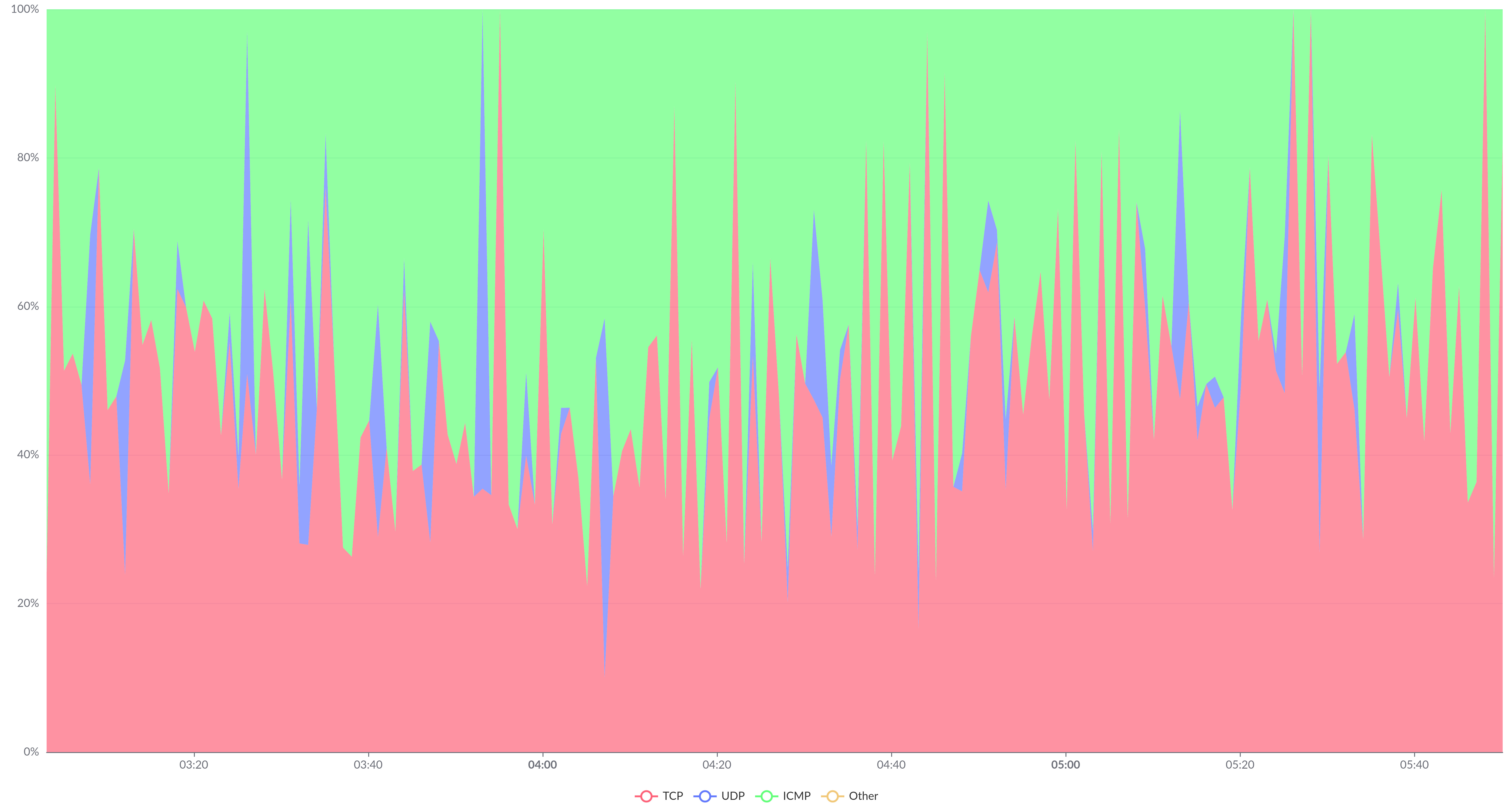
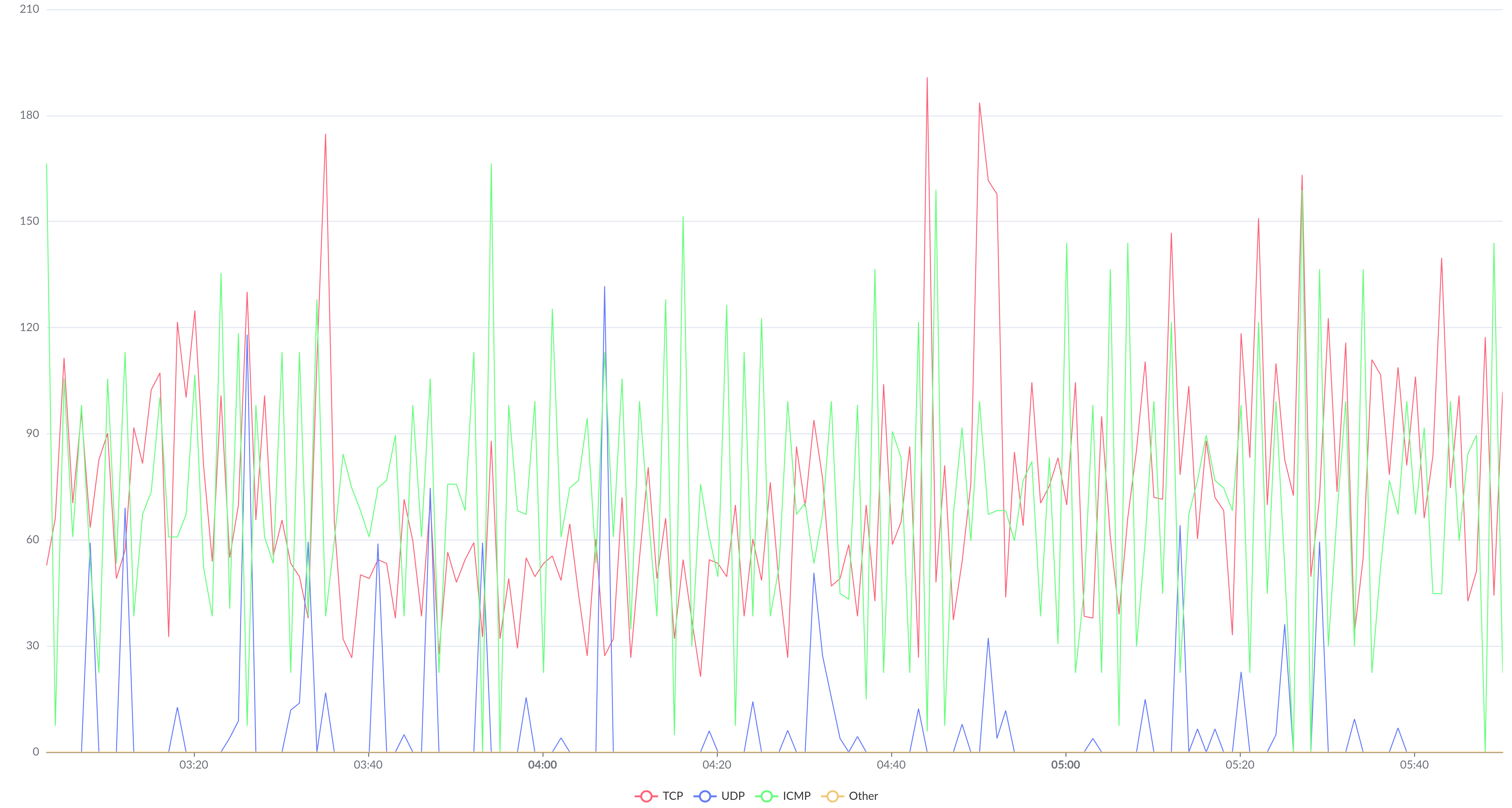
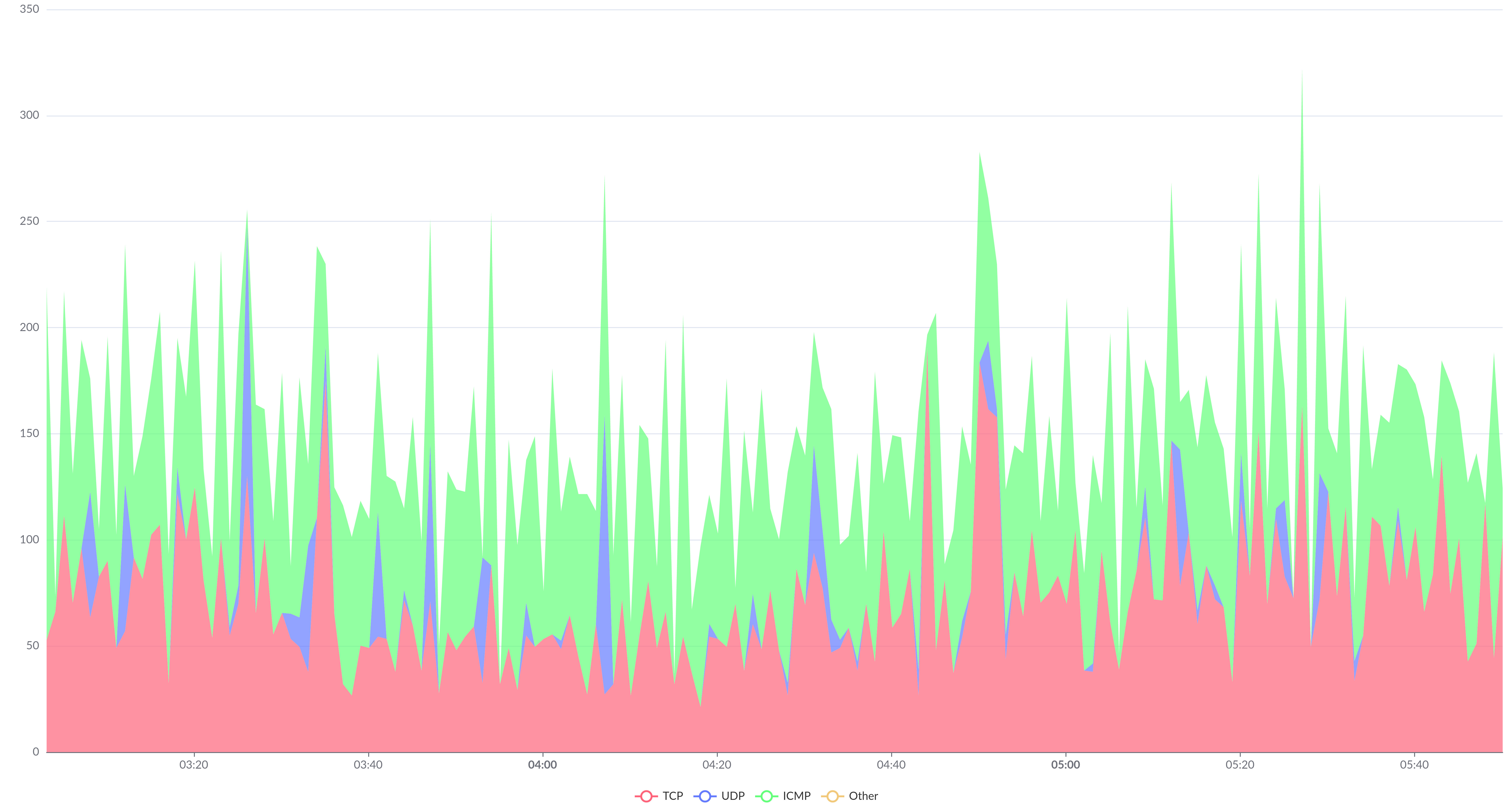
Traffic (inbound)
Volume of traffic from users, bits/sec. The TCP, UDP, ICMP, and Other protocols (all other protocols) are denoted by different colors.
-
Packets
Volume of inbound and outbound traffic per second. Different colors indicate different types of traffic:
- Inbound — All traffic from users.
- Missed — Traffic from users that was not part of the attacks.
- Outbound — Traffic from upstream to users.
-
Packets (inbound)
Number of packets from users per second. Different colors are used for TCP, UDP, ICMP, and Other (all other protocols).
-
Requests
Total number of requests per second (static and dynamic), as well as the number of dynamic requests only.
- Static requests are GET requests with known extensions in the names of requested files (styles, images, video files, etc.).
- All requests except static ones are considered dynamic requests.
-
Response time
Number of requests per second that upstream responded to within the specified period. Different colors show data for different response periods: Less than 200ms, 200-500ms, 500-700ms, 700-1000ms, 1-1.5s, 1.5-2s, 2-5s, More than 5s.
-
Errors
Number of requests per second that the Qrator Labs reverse HTTP proxy responded to with an error code. Data on HTTP 4xx and HTTP 5xx error codes are displayed.
-
Blacklist
Number of blocked IP addresses from which requests were received. Different colors denote IP addresses from the automatically updated Qrator Labs and WAF blacklists, as well as the customer's own blacklist.
-
Bot protection
Number of Checks and Blocks per second conducted under the Redirect with cookie setting.
Select period
You can change the period for which data is displayed on the chart in one of two ways.
-
Hold down the left mouse button at the beginning of the section of the chart you are interested in and, without releasing the button, drag to the end of the section. The scale of the chart will automatically change to include data from the selected area only. This zooming can be done several times in succession.
To return to the previous zoom, click . To return to the zoom level used before zooming out, click Reset zoom.
-
Select one of the preset periods from the drop-down list at the top of the page. The required data will be automatically loaded and displayed on the chart. The chart scale (see previous paragraph) will automatically reset.
The default period is 5 hours.
View selection
For all data categories except Requests
, a view switch is displayed above the chart. Use it to present the data in one of the following ways:
Different values are shown as independent lines on the chart.
This view type is used if the Stack and Stack 100% options are disabled.
The volumes of different types of traffic are shown in different colors on top of each other, allowing you to assess the share of each to the total.
To select this view type, set the Stack option.
It is formed similarly to the regular stacked bar chart, but the total value at each point in time is taken as 100% and is displayed on the entire height of the chart.
To select this view type, set the Stack 100% option.